| bahamutzero | Date: Tuesday, 28/Jun/2011, 4:02 AM
|
|
Private
Post: 6
Reputation: 0
Status: Offline
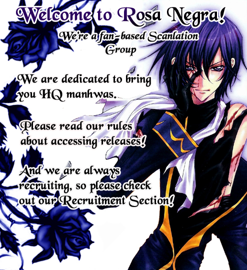
| First of all, the design of this web site is bit messed up. Having three big boxed above sometimes force me to scroll down everytime I click any forum link.
And the banner picture is too big too IMO, take up a lot of space there.
But so far, good picture and nice design
Cheer
|
|
| |
| hinatac | Date: Wednesday, 10/Aug/2011, 5:22 AM
|
 Private
Post: 6
Reputation: 0
Status: Offline
| Hi
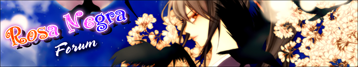
I guess you're right, but OMG I don't mind seeing the hot sexy uraboku characters everytime I click a forum link 
Hmm.... maybe I would make a larger and less-tall 'welcome to rosa negra' banner, and put the other 2 boxes to the side (like the menu), but I'm a web designer so I know what kind of pain-in-the-ass that could turn out to be 
not to mention that the web site would have to be 'on reparations' and we would not be able to access here while doing that 
P.S. Sorry if my english is too crappy, it is not my language so ... 
|
|
| |